Project:
Underdog
(2023-24)
Focus:
Brand Identity
Typography System
Menu Design
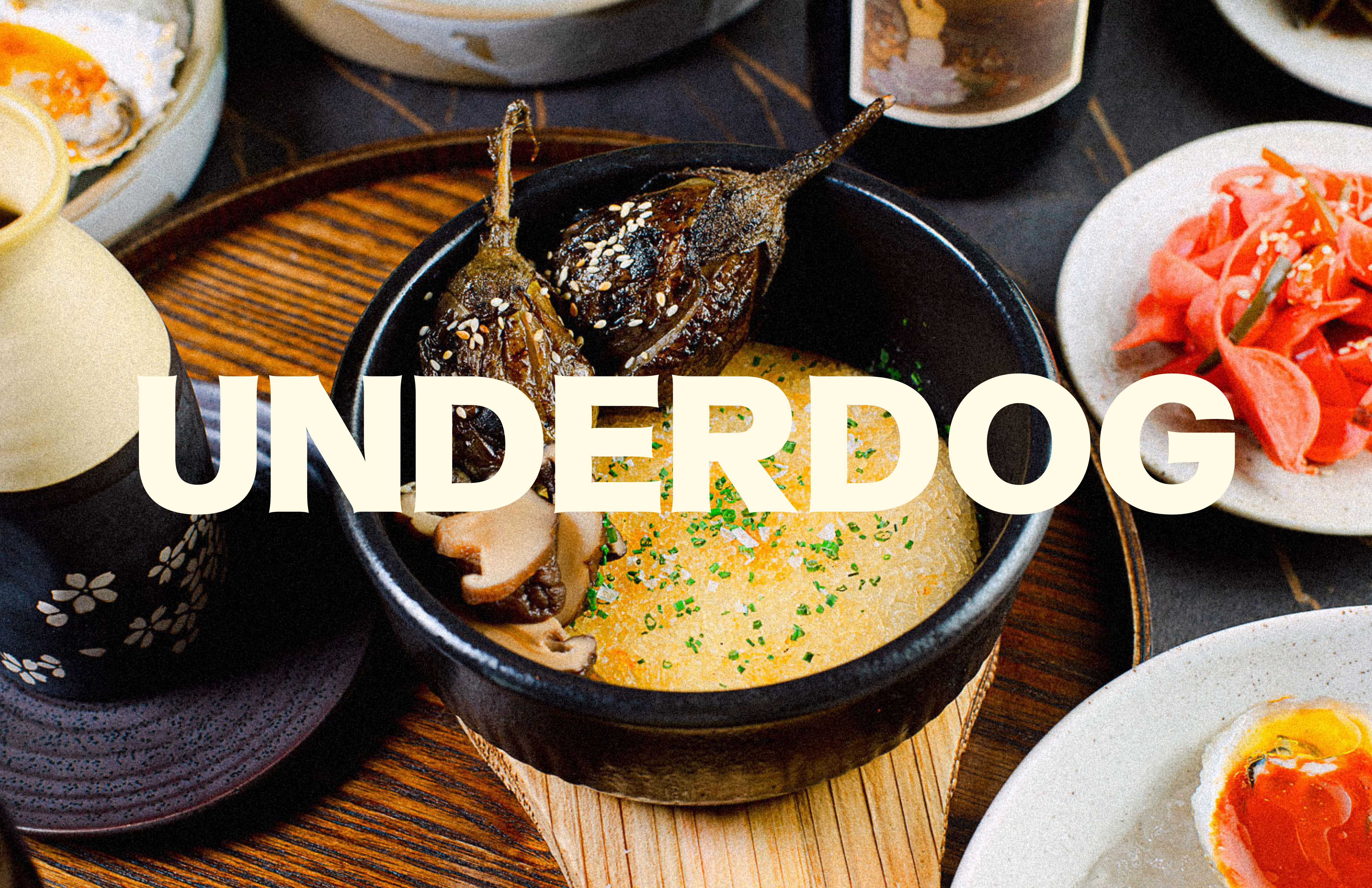
Owned and operated by partners Richard Hargreave and Claudia Lee, Underdog—a wine bar and Korean restaurant in Austin, TX—approached us to rebrand the nearly one-year-old venture, with the aim of building a visual ecosystem that felt more in line with their vision for the brand.
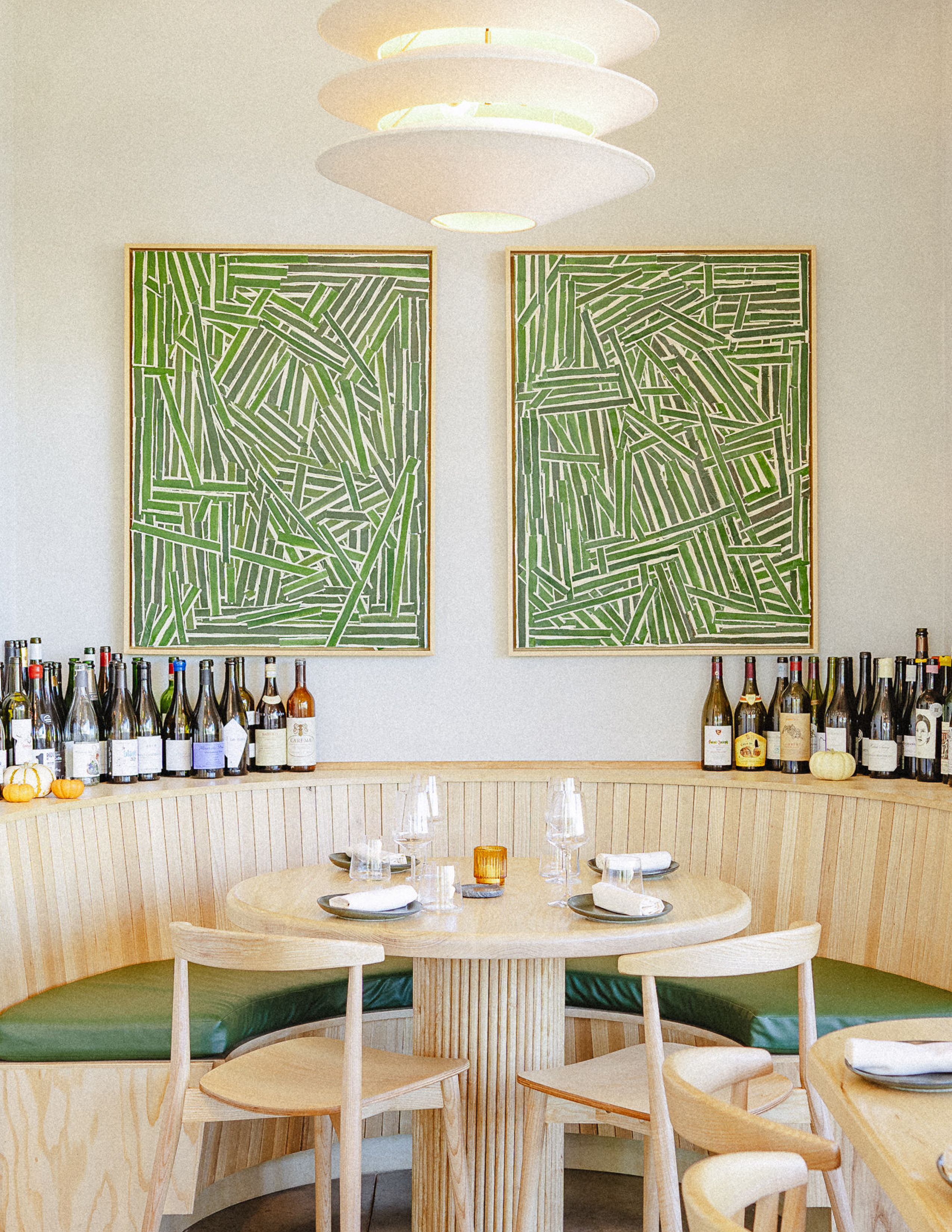
Through our initial discussions we quickly aligned on the need to express the brand as rooted in heritage, blending Lee’s South Korean origins and Hargreave’s experience establishing Momofuku globally, but with a distinctly contemporary focus when it came to presentation, service, and atmosphere.
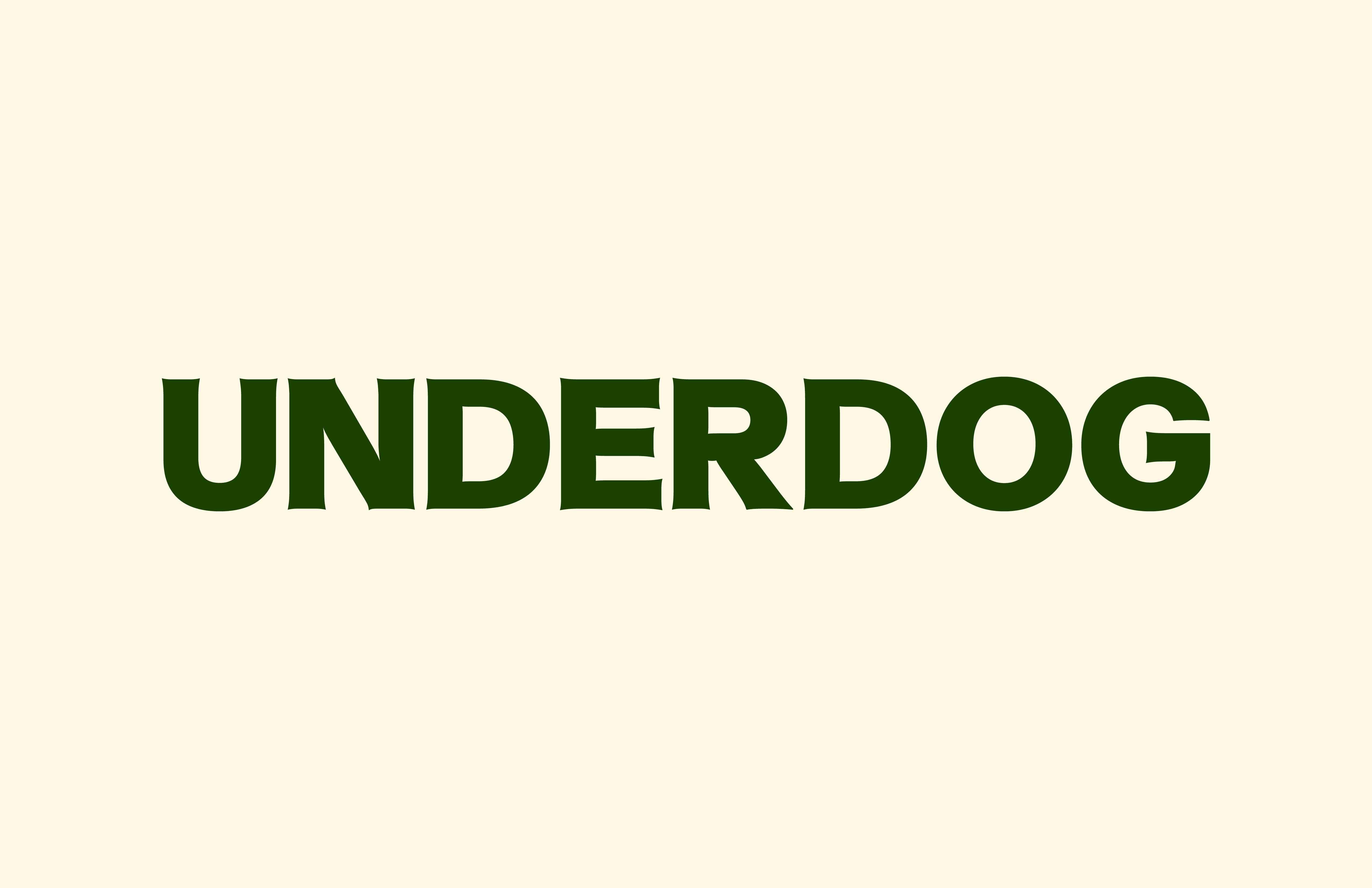
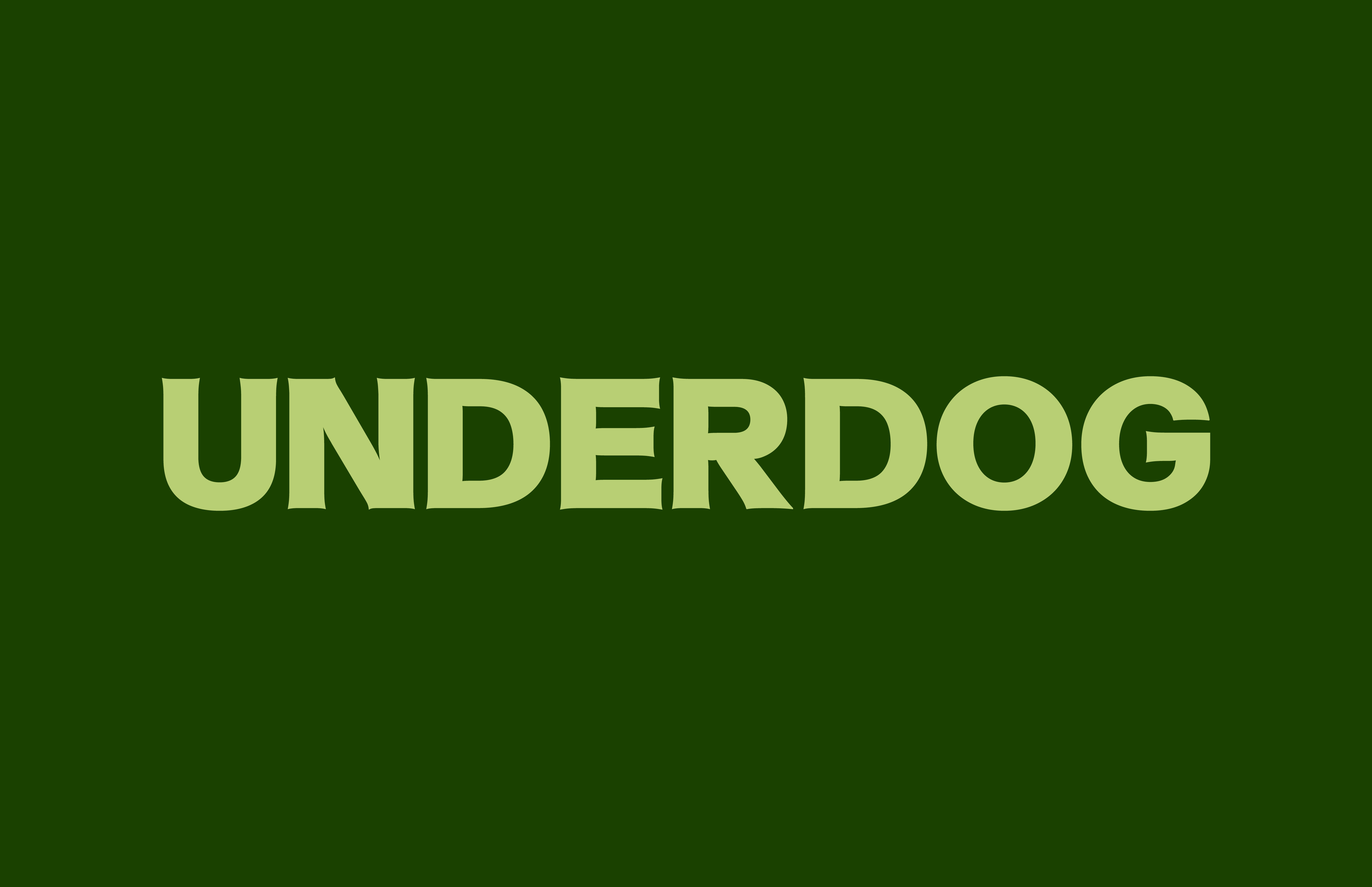
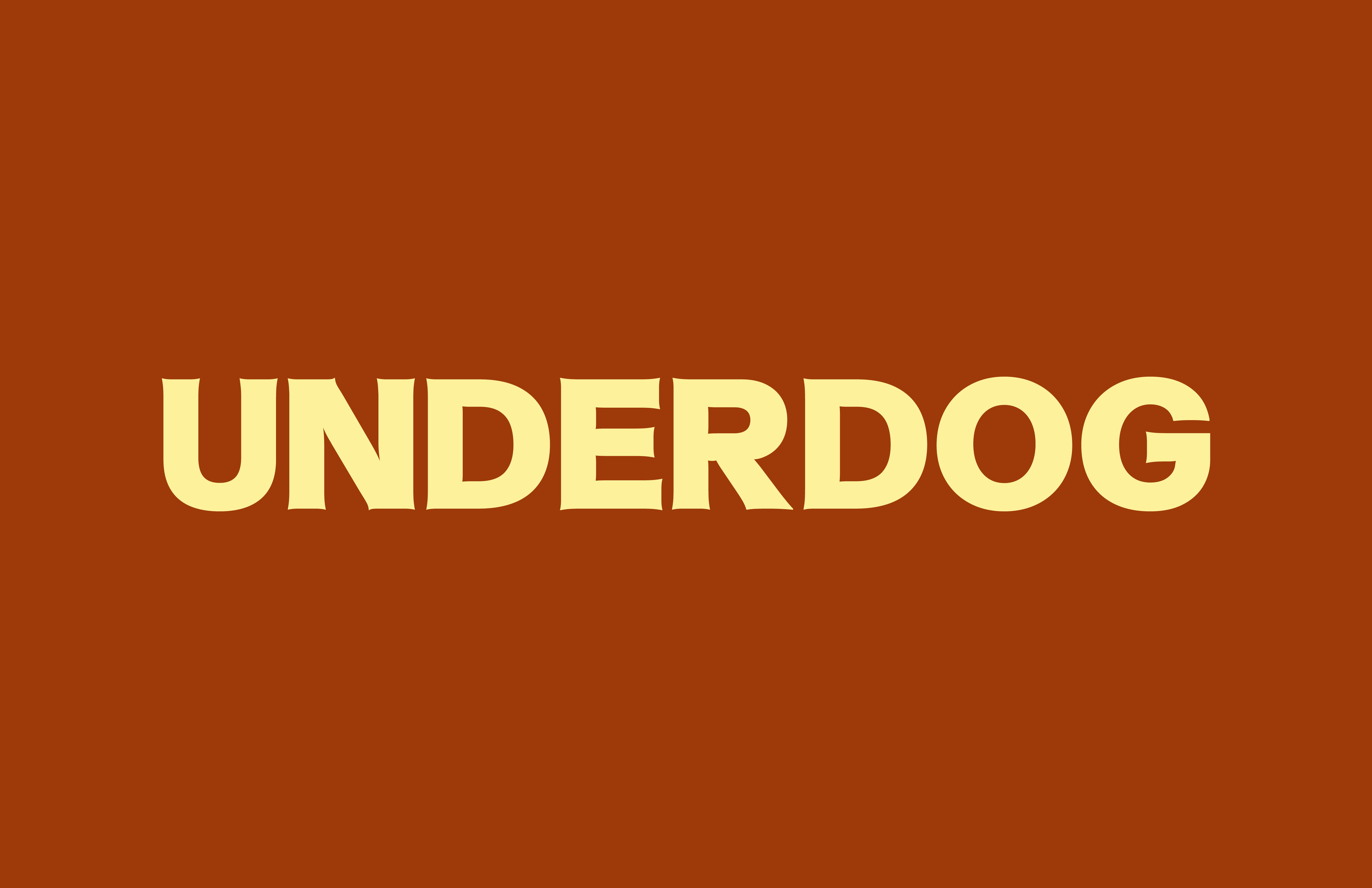
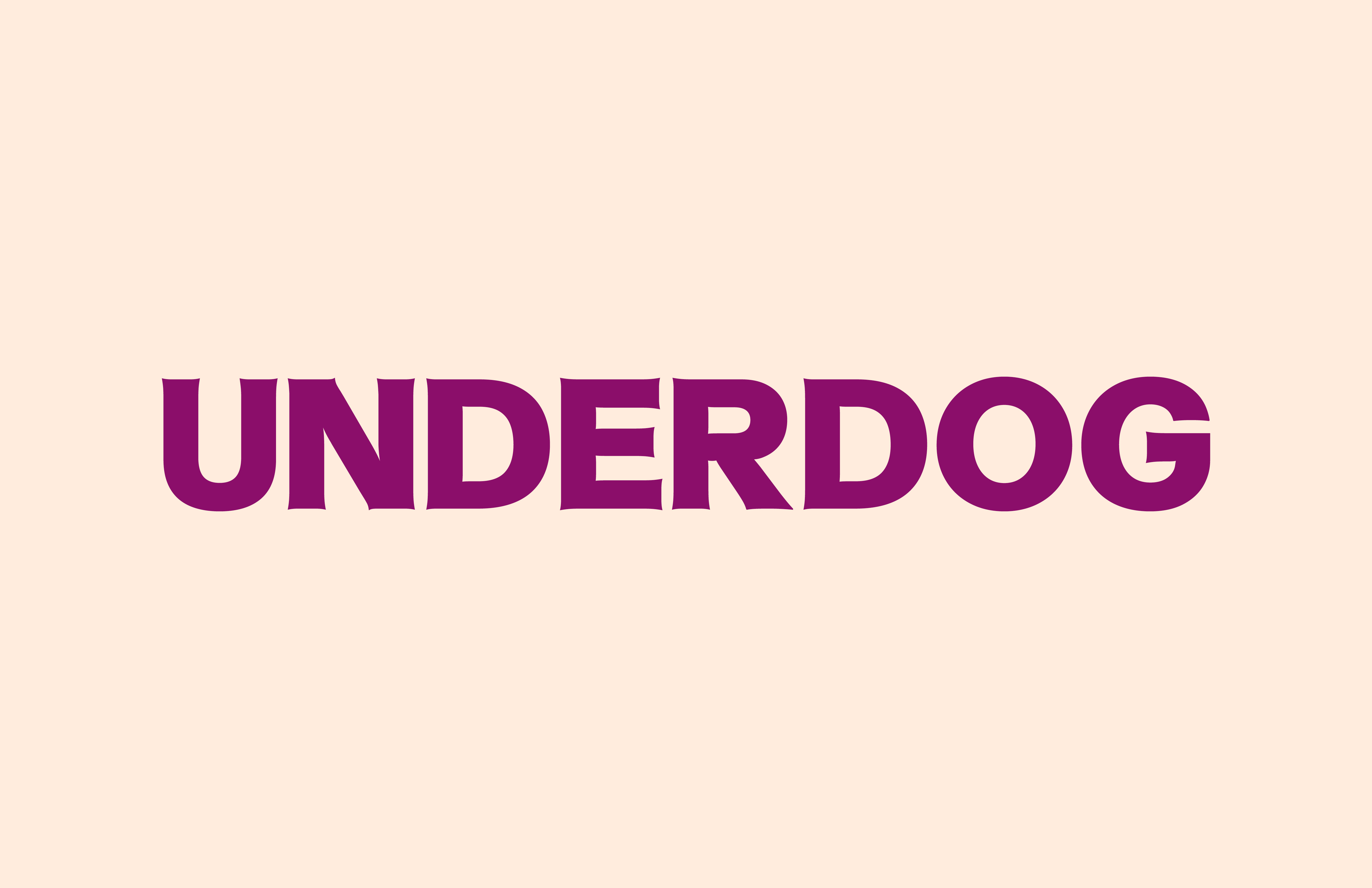
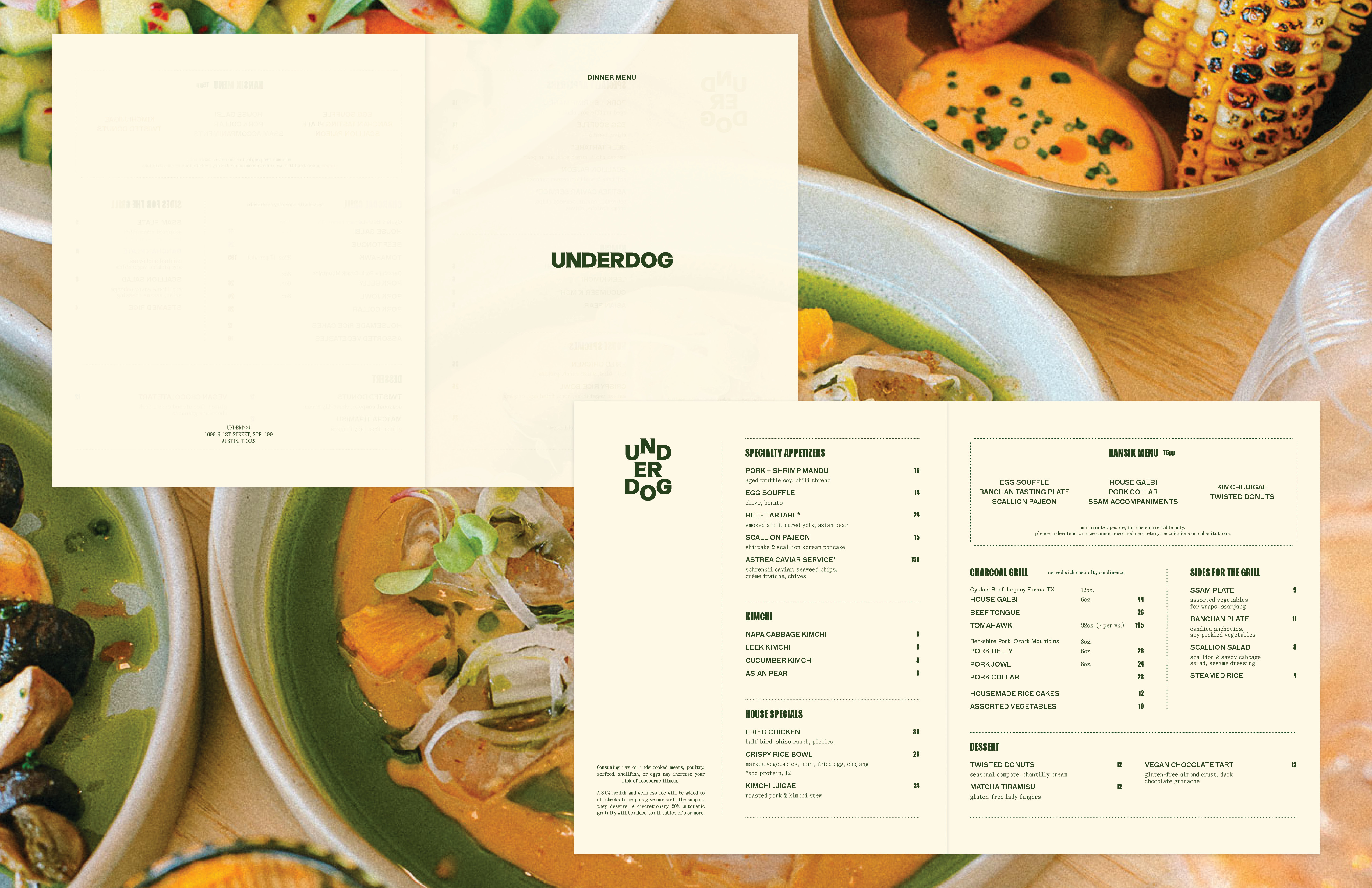
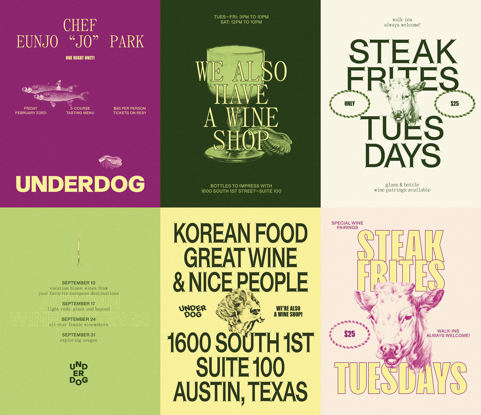
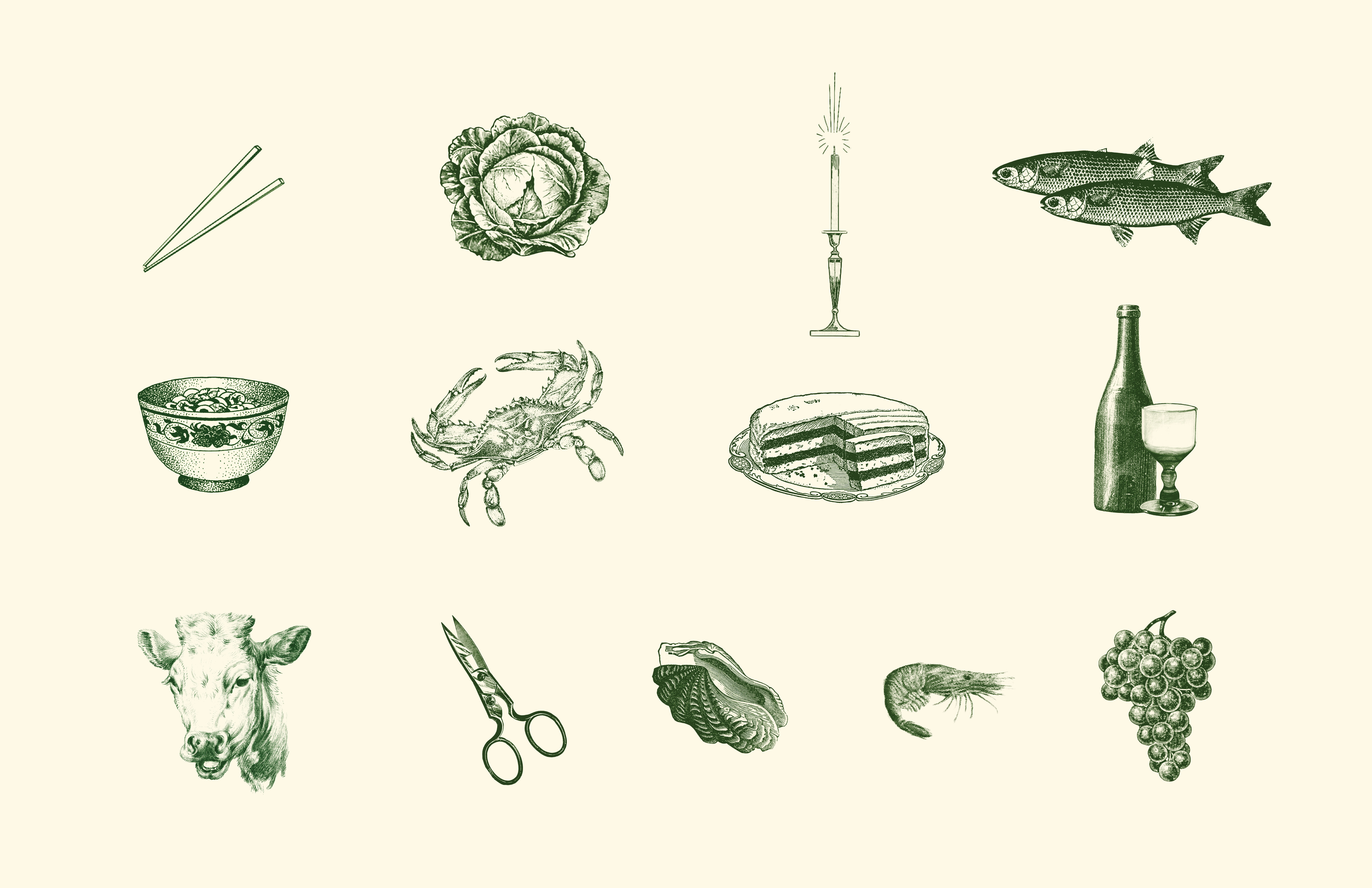
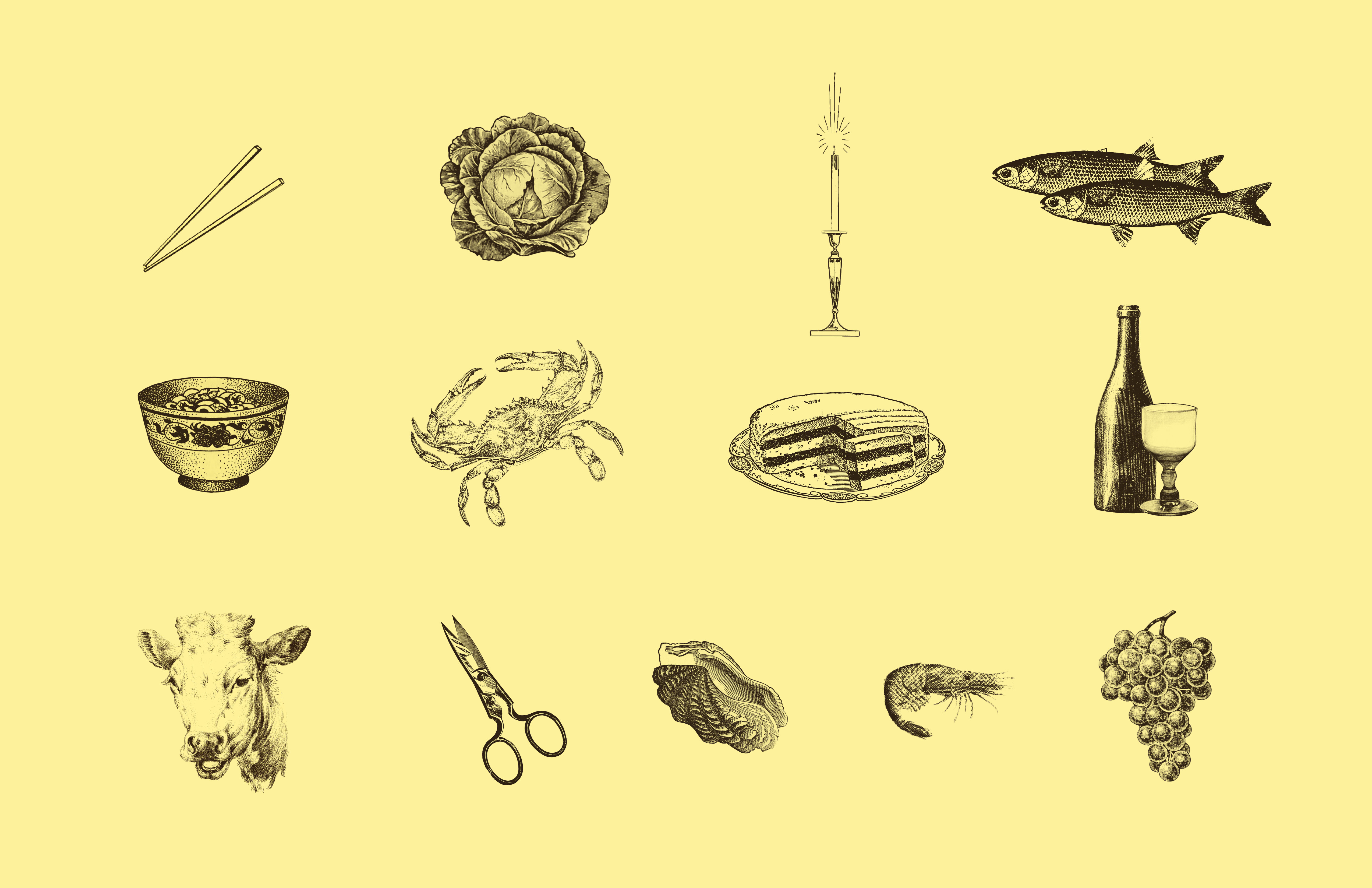
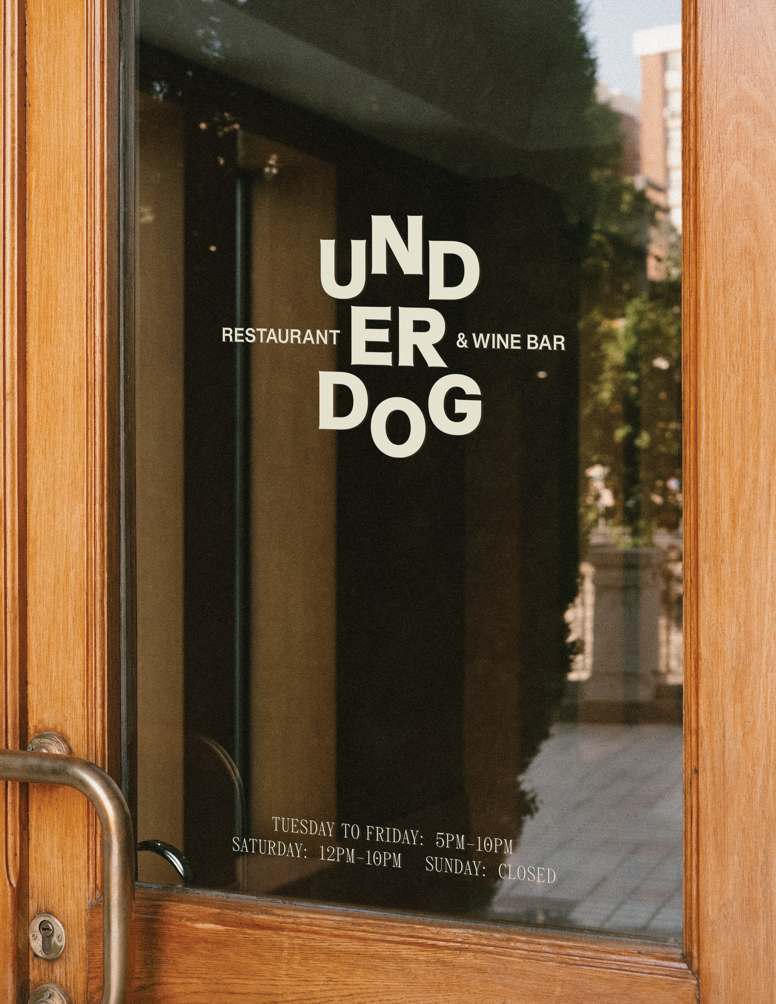
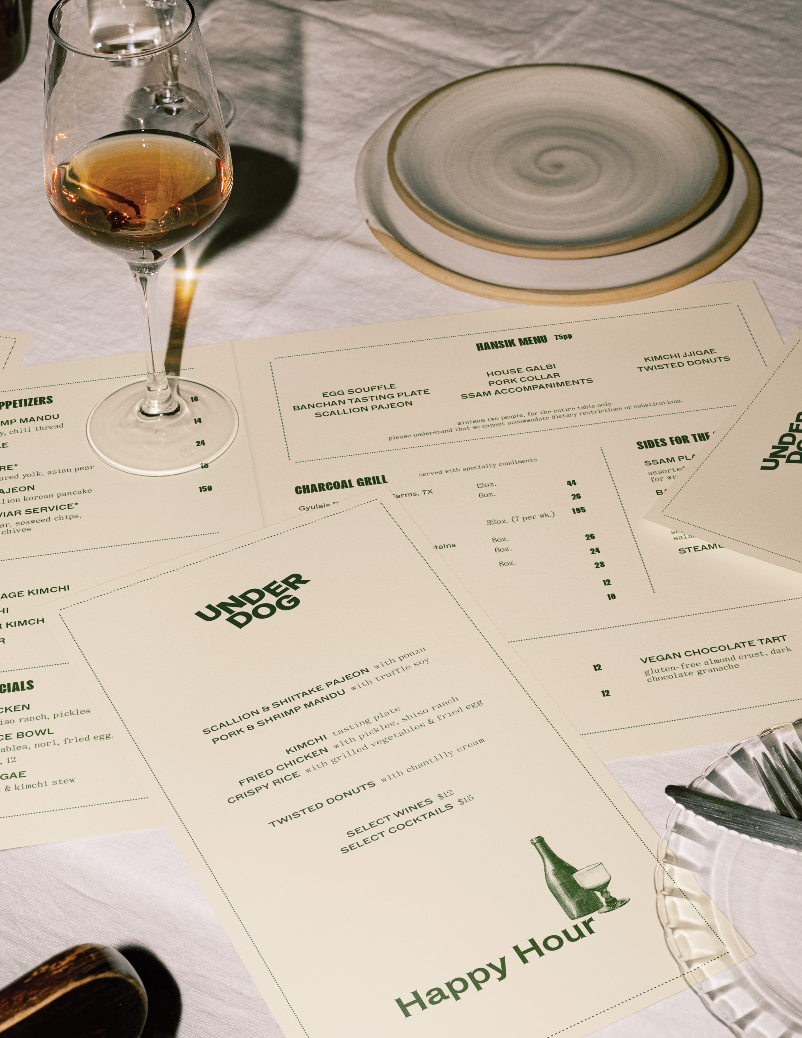
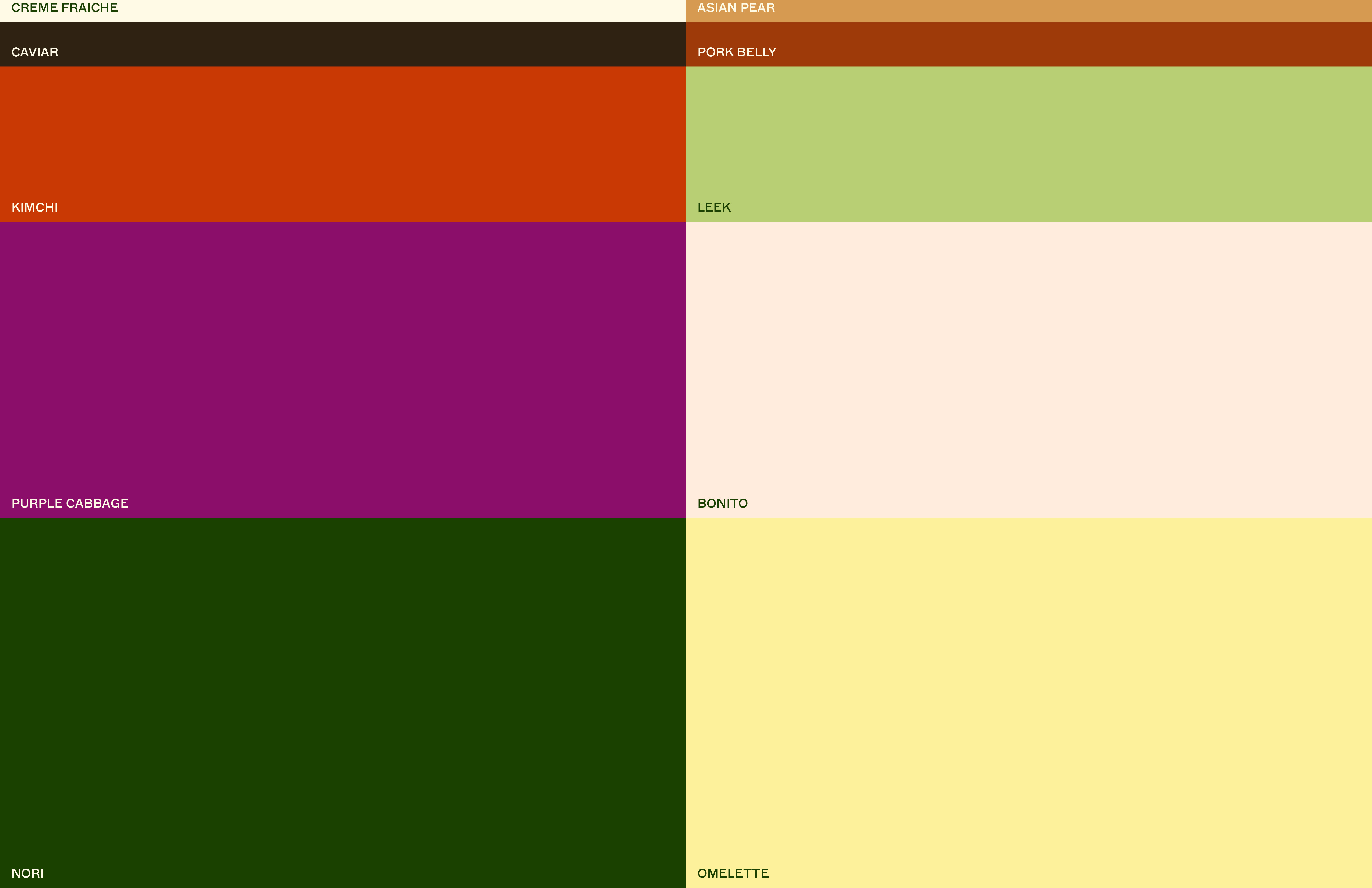
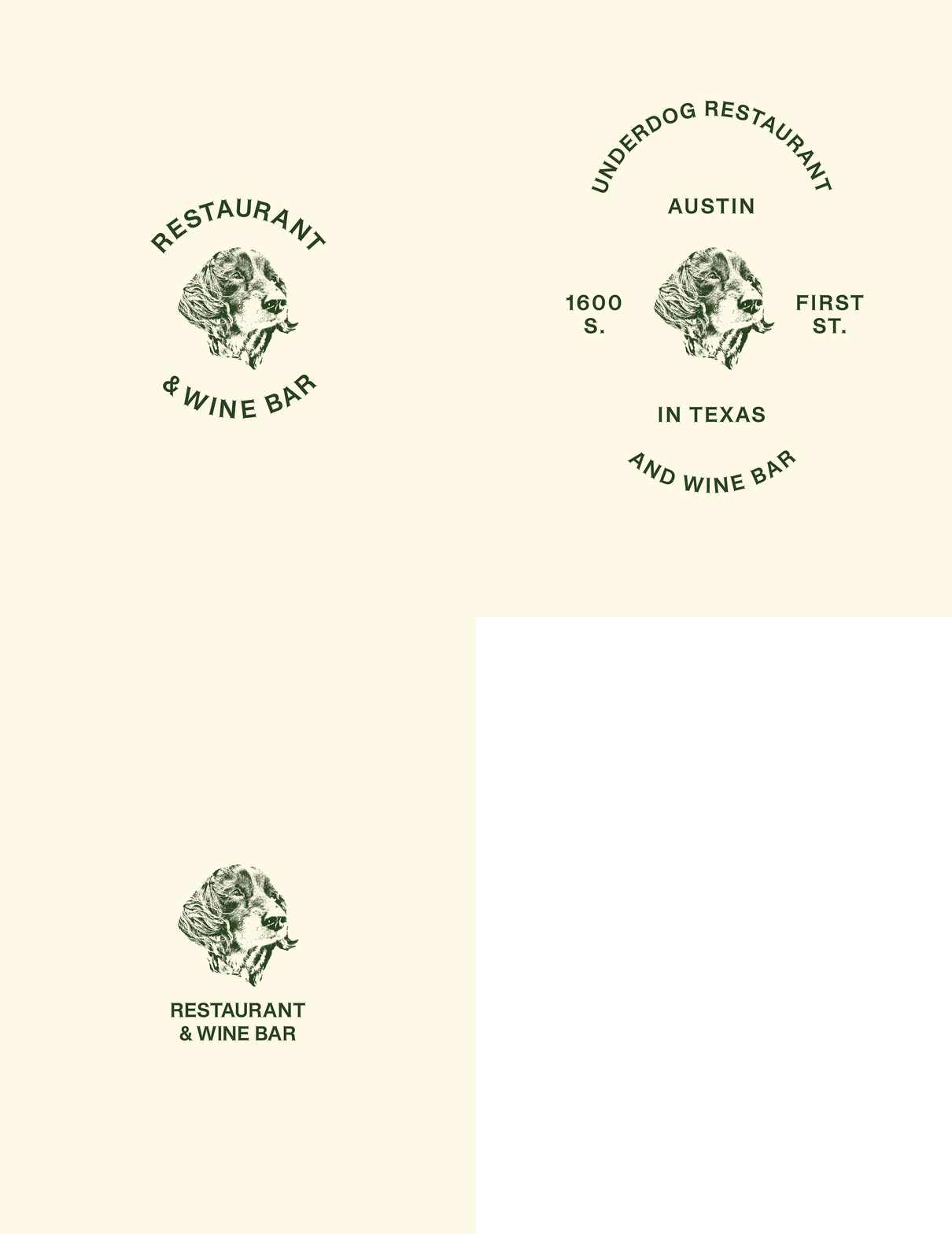
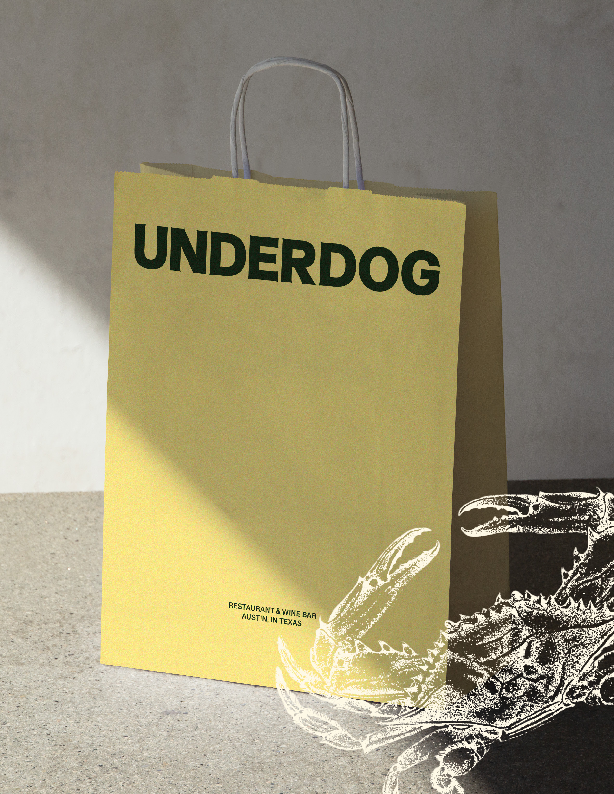
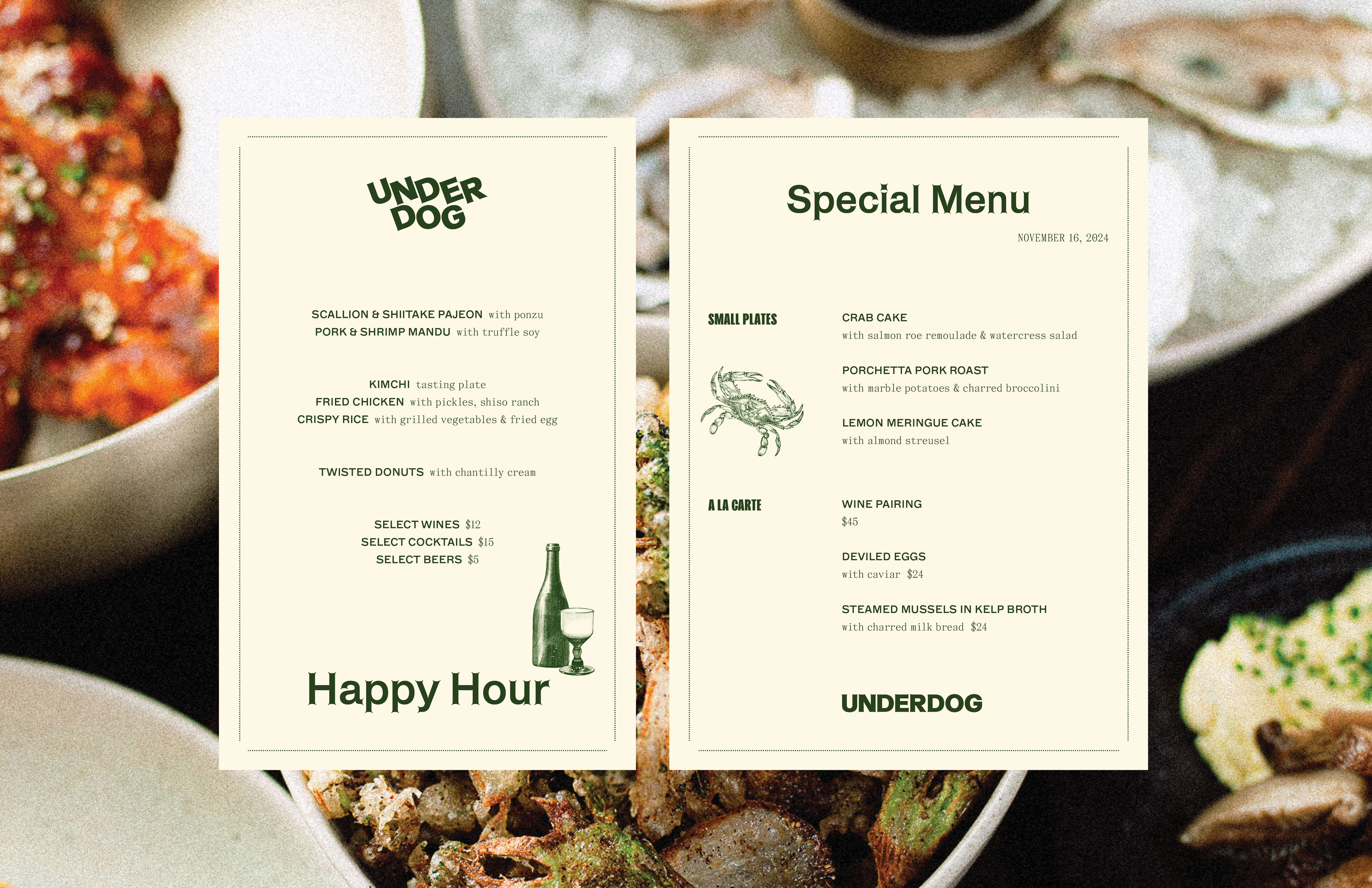
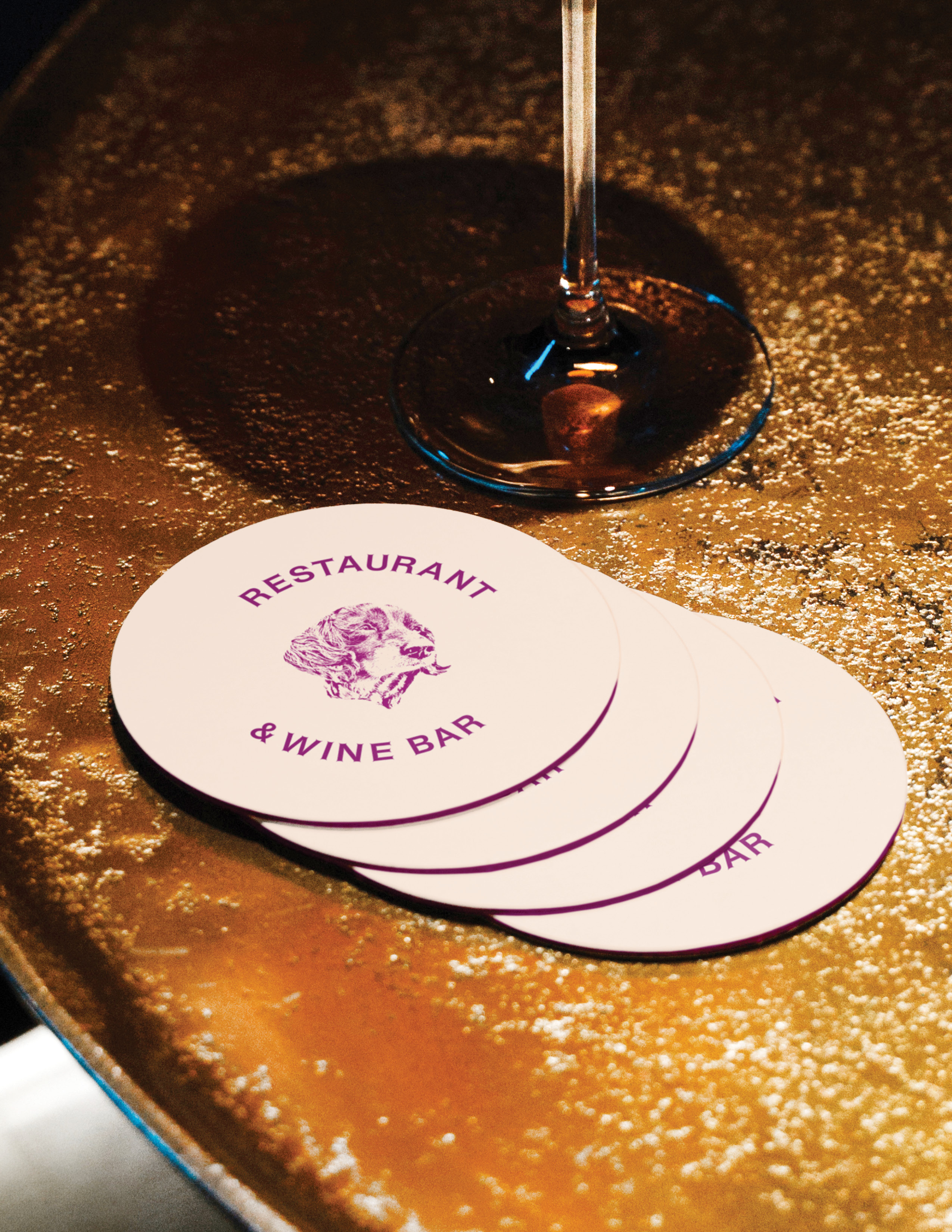
The approach for solving this came first through the evolution of the Underdog wordmark, set in all caps to generate a sound, institutional impression and reworked with Dinamo’s Helveesti in heavy weight, accentuating it’s read and conveying an understated elegance. Next, was the creation of a publicly–sourced illustration system showcasing a series of culinary staples and table essentials, developed and treated through hours down the rabbit hole amongst vintage Korean cookbooks. We also incorporated supporting type families directly steeped in history to support this framework within menus and printed matter, and a color system influenced by both the striking palette of the ingredients in the dishes offered as well as the soft tones of vintage Korean cinema. We knew we wanted elegance and elevation, yet coupled with vibrancy and curiousity, so while the graphic system contains nods to the past, layouts and implementations are set up to distinctly make a mark in the now.






Team:
Creative Direction + Design: Cameron Brocksen
Photography: Chad Wadsworth
Photography: Chad Wadsworth